Friday, September 28, 2012

Walkin' in a Floral Wonderland


               When I first found out that our class was going to be held at the arboretum I was thrilled.  My RA took our whole floor there to get our pictures taken and to do some activities with another floor when we first arrived on campus, so I knew what to expect.  Personally, I would choose to spend class outside exploring over sitting in a cramped, dull classroom any day.  Although I had been to the arboretum before, I was only near the fountain and did not have much time to look around.
 

                We arranged to meet at the big pavilion at the arboretum.  When we were standing under it talking, I was gazing around, wondering why I hadn’t spent more time there.  The pavilion is a giant stone structure with white drapes flowing down around the perimeter; it looked to me like the perfect place to have a luxurious picnic.  When we were finally unleashed to explore the grounds, I notice that the arboretum was more than just flowers; it expands out miles and miles through paths in the woods and there are plans for further development.
 

                I enjoyed the arboretum because you could take your time strolling down the countless winding paths and you would never end up at the same place.  There were numerous different spaces and they all had something unique about them.  The 
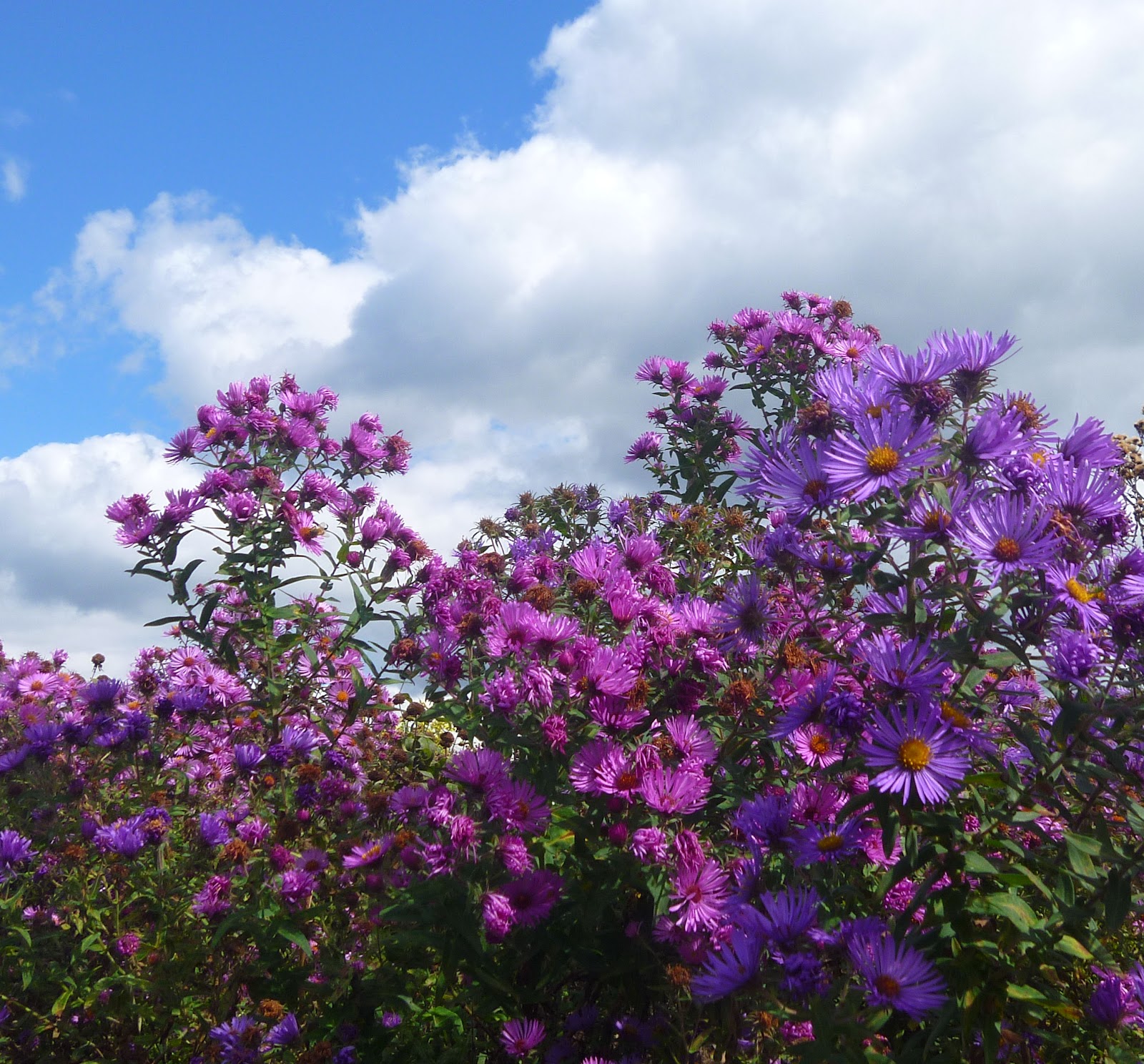
first space I walked through was a vibrant array of colorful flowers.  My favorite flower in this section was a sunburst of colors, starting with yellow in the middle, and transforming into red on the tips of the petals.  The warm colors contrasted nicely with the green stems and leaves.

                As I continued down the path I ended up at a arch entangled in vines.  Through the arch was a sunflower paradise. I’m not exactly sure why, but I associate sunflowers with hippies, so this space was peaceful and relaxing to me.  I also saw some unique sunflowers that stood out to me.  They looked like sunflowers, acted like sunflowers, but they did not resemble the sun in any way because they were maroon!  This baffled me because I have seen numerous plants and flowers in my days, but never have I seen a purple sunflower.

                Once I got over this fascination with the discolored sunflowers I went in search for the fountain.  I got distracted (typical) on the way there when I was trying to smell a flower and came face to face with a bee!  It was a close call but I got away without a sting.  I eventually ended up in an area with a circular pond.  The pond was full of assorted lilies and lily pads.  I became extremely tempted to try to sit on the gigantic lily pad in the middle of the pond, but I resisted the urge because being wet wasn’t an option on that frigid day.  I settled for just taking pictures and ended up spotting a comet (fish, not extraterrestrial mass… yet just as lucky).

                I thoroughly enjoyed my time at the aboredum and know that I will find myself back there in the near future.  This trip reminded me a lot of home because my parents are avid gardeners.  Not only do we have our own mini arboredum, we also have a pond surrounded by plants, and full of fish.  One of these times when my parents come to visit I will make sure to take them to the arboredum to share the beautiful landscape, and stunning architecture with them. 

Wednesday, September 12, 2012

Girl Power

Affirmative Action by Jerry Kearns 
 
           When I was first looking around the Palmer Museum I saw a lot of different pieces that caught my eye.  I went around taking pictures and writing descriptions of everything, but I knew right when I saw the painting Affirmative Action by Jerry Kearns that it was the one that I would do my blog post on.  This piece caught my attention for a few different reasons.  To start off, it might have been less elaborate and colorful than the other ones, but it said so much more.  It wasn’t just a painting, it was an argument.

            The first thing that I thought about when I saw this piece was women’s rights.  With a little more research, I discovered that the artist of this painting, Jerry Kearns, was a cultural activist.  He takes issues that he is passionate about and makes statements through his art.  Kearns got is MFA degree from UC Santa Barbra and won the Rome Prize for Sculpture in the same year.  Shortly after he joined a multitude of different activist organizations and continued to speak through his art.  Today his work is displayed throughout 33 different museums and public collections.

            Kearns was an American artist and he was born in 1942.  A year after his birth the view on women in the workforce changed dramatically.  It was during World War II and there were tons of new factories opened to produce weapons.  When it was time for the soldiers to be deployed the companies realized that they didn’t have enough workers to continue with the amount of production that they needed.  The government came out with “Rosie the Riveter”, the ideal working women, to lure women into the workforce.

            This painting is quite similar to Rosie the Riveter.  The woman portrayed in Affirmative Action is a strong, hard working woman.  The look on her face makes her appear determined to accomplish whatever comes her way.  She is shoveling dirt which is not an ideal job.  She is doing the dirty work while still dressing to impress.  At the time when this was painted, many people saw women as always having to look nice. They not only had to look good but they were also expected to, not only take care of the household, but also take on a job.  Another thing to point out is the perspective of the painting.  The woman is a giant in comparison to the red and yellow cityscape behind her.  This makes her seem like she is, once again, very determined.  She is ‘on top of the world’ and nothing can stop her.  The colors that Kearns chose for the background are ones that represent anger and energy.  All of these things together make for an awfully moving piece of art.

            I chose this painting mostly because I am a firm believer in women’s rights.  Not only should women be able to work the same jobs as men, but they should be treated equally.  In the era that this was painted women couldn’t even compete with men for jobs.  A lot has changed since then but things are still not equal; there are still some women who are getting paid less to do the same exact job as men.  This piece of art makes a very strong statement against what I believe to be an extremely relevant issue.

            Overall, my experience at the Palmer Museum was enlightening.  It is interesting to see how different people express themselves in different ways.  Some people express themselves verbally but these artists have a way of speaking through their art.  There were a variety of different pieces from paintings to sculptures to drawing, but they all had something to offer.  I never thought of myself as a “museum-goer”, but I would consider visiting other museums after my trip through the Palmer.

Sources: http://oneartworld.com/artists/J/Jerry%20Kearns.html
                http://www.nps.gov/pwro/collection/website/rosie.htm


Tuesday, September 4, 2012

Who? What? When? Where? Why?

Title: The first thing I thought about when I was making my blog was the title.  I wanted it to be something that fit my personality because this blog is supposed to represent who I am as a person.  I chose the title "The Blissful Blogger" for a couple reasons.  To start off, my name starts with a B and it's a blog so I knew I wanted an adjective that started with a B to be in the name.  I thought blissful was a good fit because I find myself to be a generally happy person.

Template: I centered the design of my blog around the title.  The title I chose was "The Blissful Blogger" so I thought the layout should look girly and happy.  I chose a dark background because the point of a blog is to focus on the words and not on the background, but I also didn't want a plain background because that is boring.  I settled on a subtle pattern to add some character to the blog.  I also changed the main section of my blog to white to make my writing visable and easy-to-read.

Color: I already mentioned that I chose a dark color for the background so that it did not distract the reader from the writing but I wanted to add color in places such as the title, links, and header to make the blog look more interesting.  I chose the color blue because along with happy, I am also a very mellow person, and blue happens to be my favorite color.

Font: I wanted the font to match the design that I chose for the rest of the blog so for the title, date, and headers I chose a curly, elegant font called pacifico.  I knew the main purpose of the blog was to share my writing so I chose arial for the normal writing because sans-serif fonts are easier to read on the computer.  Finally, I wanted the titles of my posts to stand out and be easy to read so I chose a plain thick font, Impact. 

Pages: I only have two pages (so far) so I didn't want to have them along the top of the page because it looks odd when they are all of the left side under the title.  I moved them so that they were on the right sidebar so they are still easy to see but they are not the first thing that you notice.  I am going to make a short about me section so the readers can match my words to a face and get to know me a little better.

Other: Along with the pages on my blog I also included a picture, and a blog archive.  I added the picture because my blog was looking dull and I knew I wanted to add something else.  This class has a lot to do with arts and creativity and I believe the picture I chose fits those topics perfectly.  I also chose to add a blog archive so that it would be easy for people to look back and find old posts without having to scroll all the way down the page.